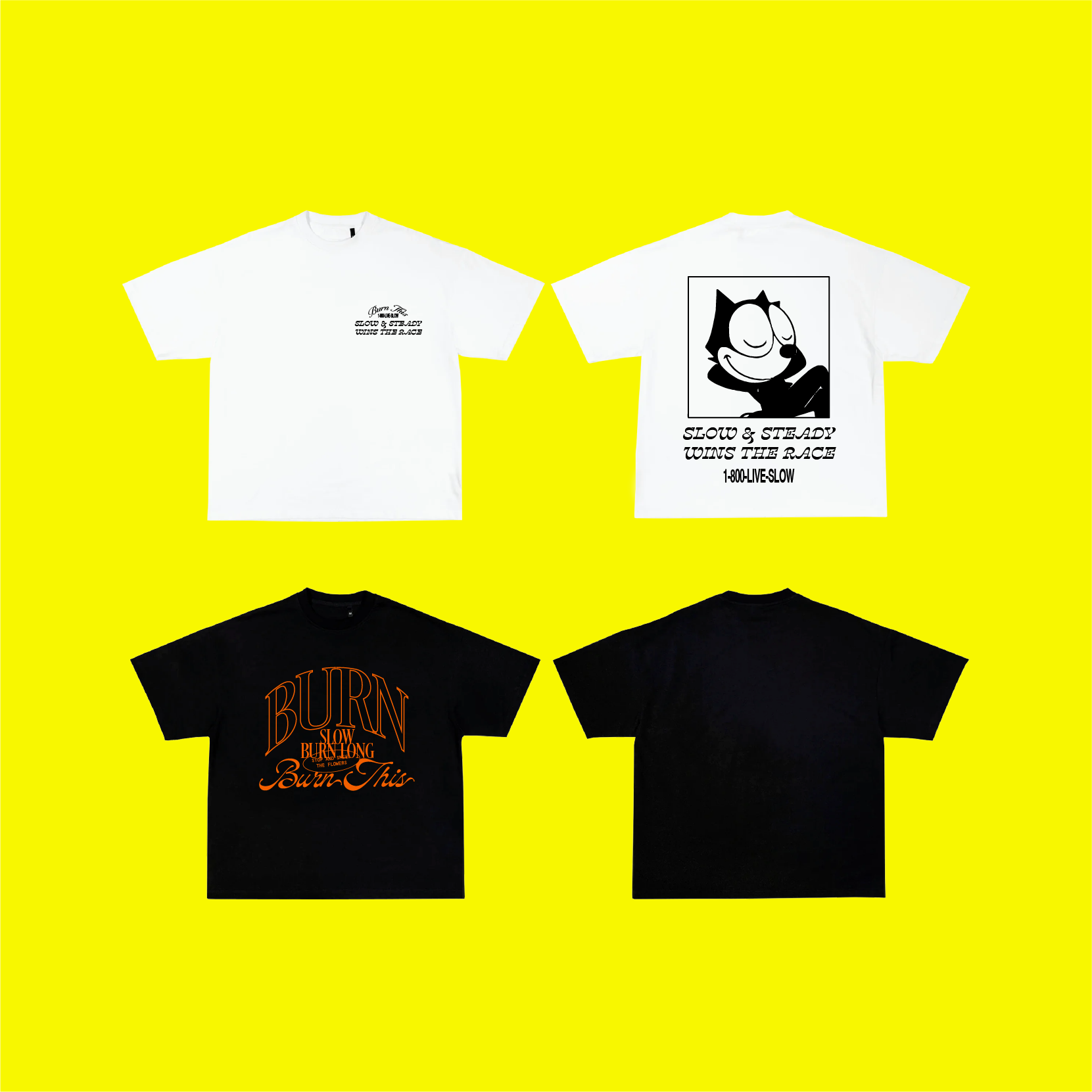
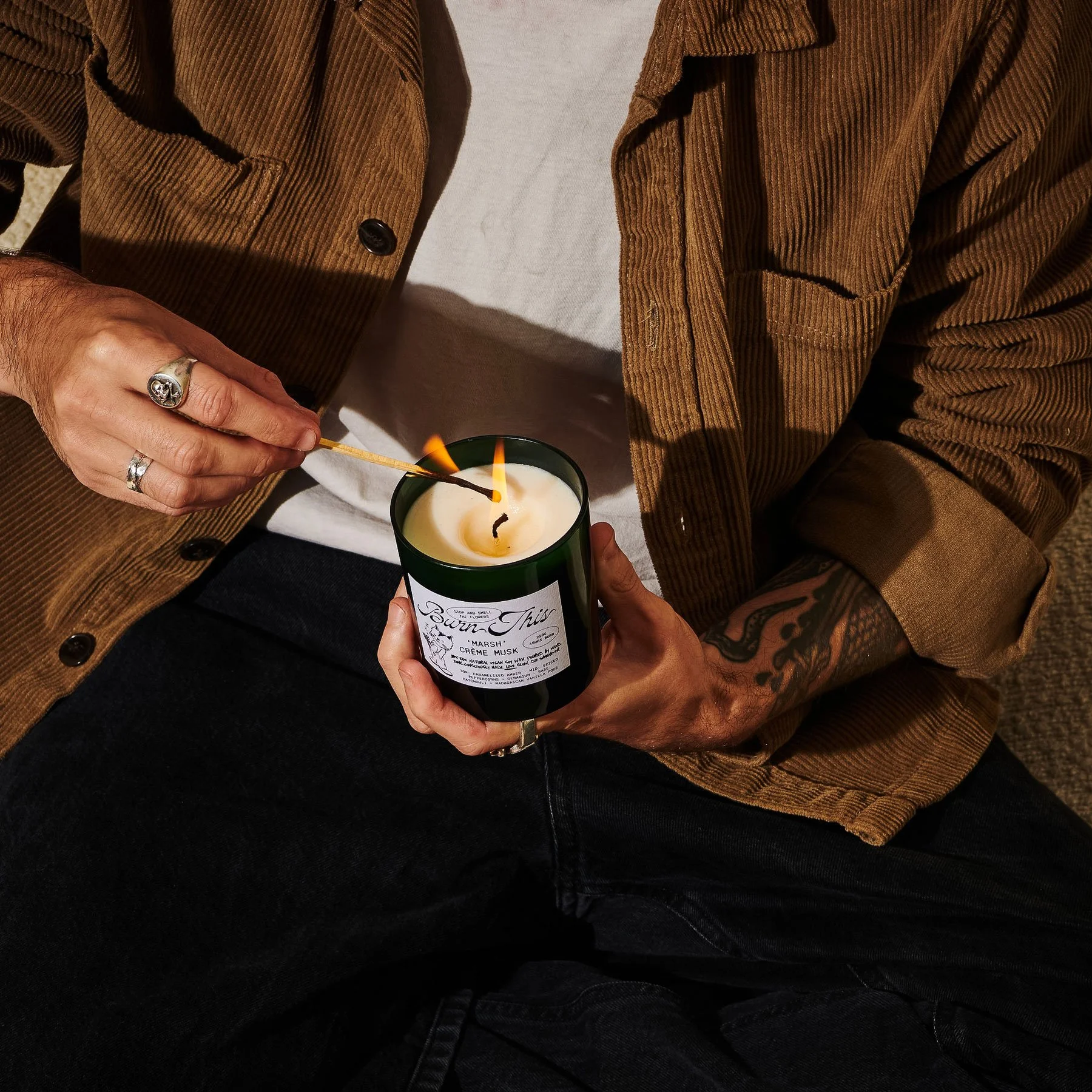
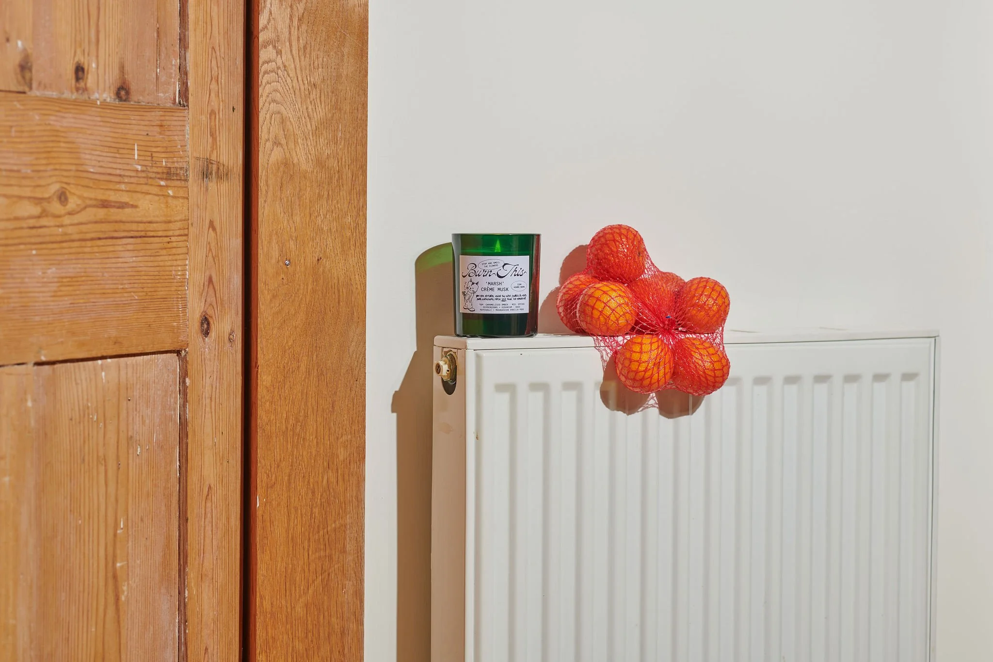
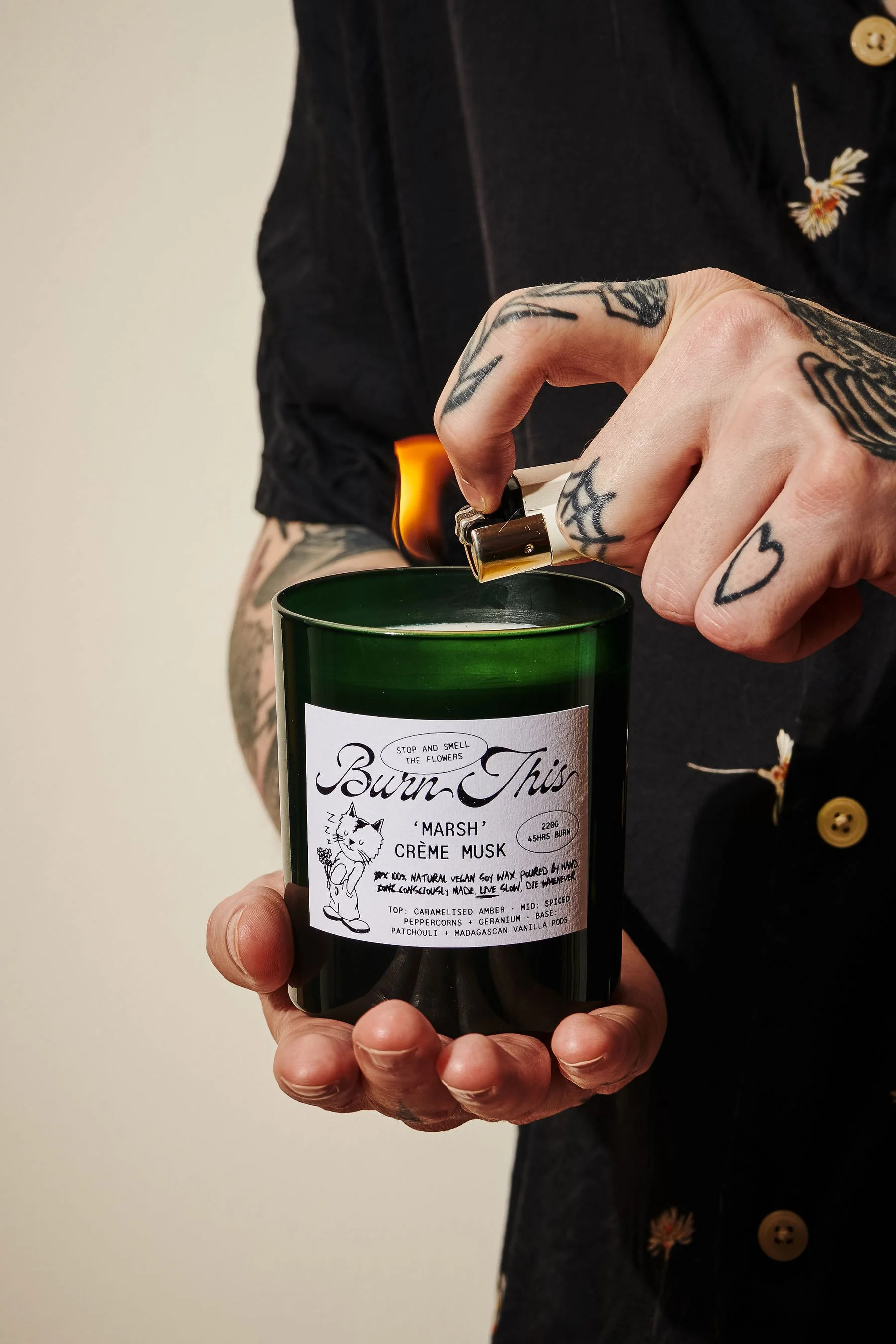
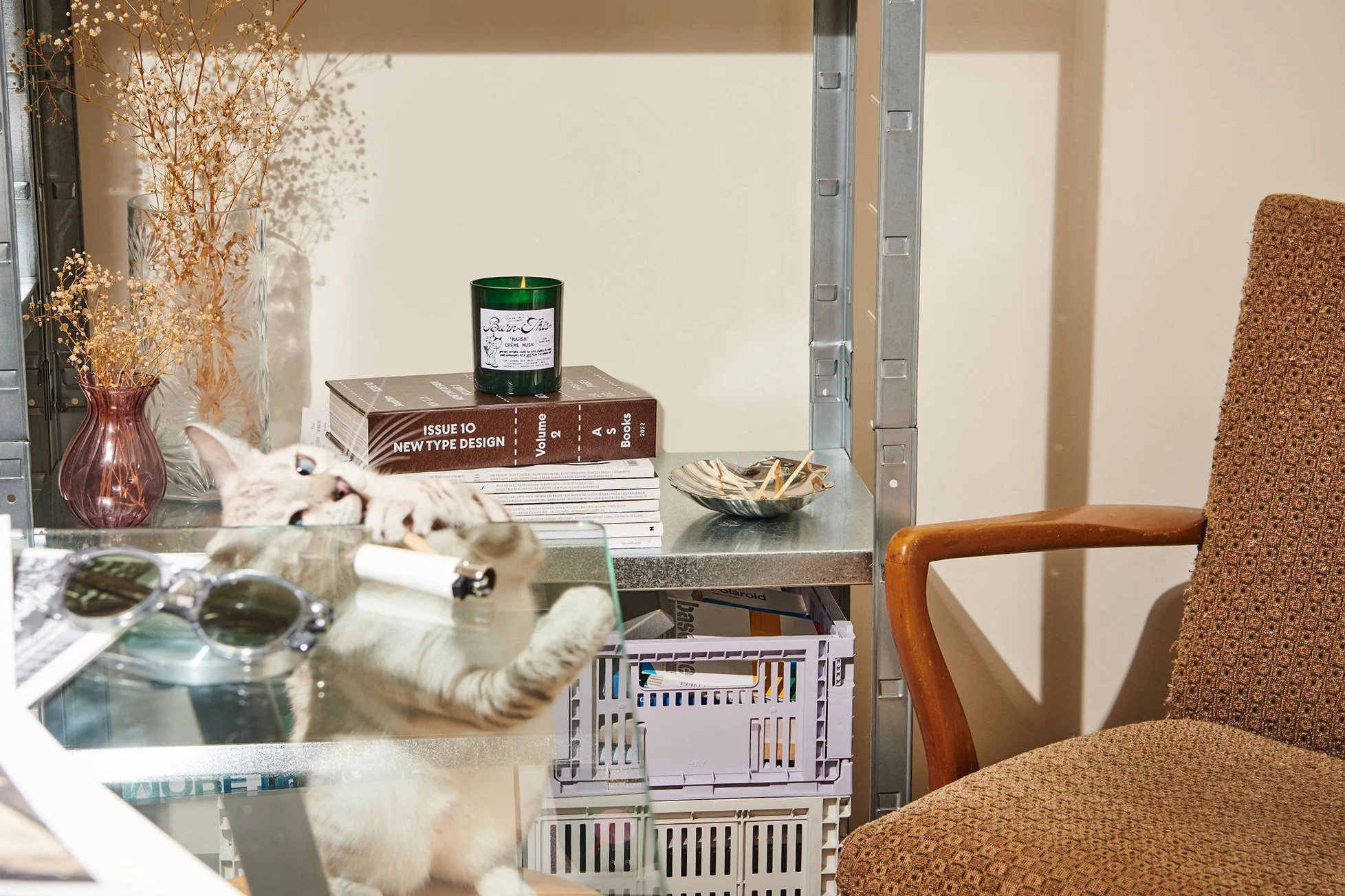
A candle brand with no interest in behaving like one — turning wellness into something more abrasive, characterful and alive. A challenger brand built around attitude, texture and the comfort of chaos.
Client
Burn This Candle Co.
Services
Creative Direction, Art Direction, Brand Direction, Strategy, Graphic Identity
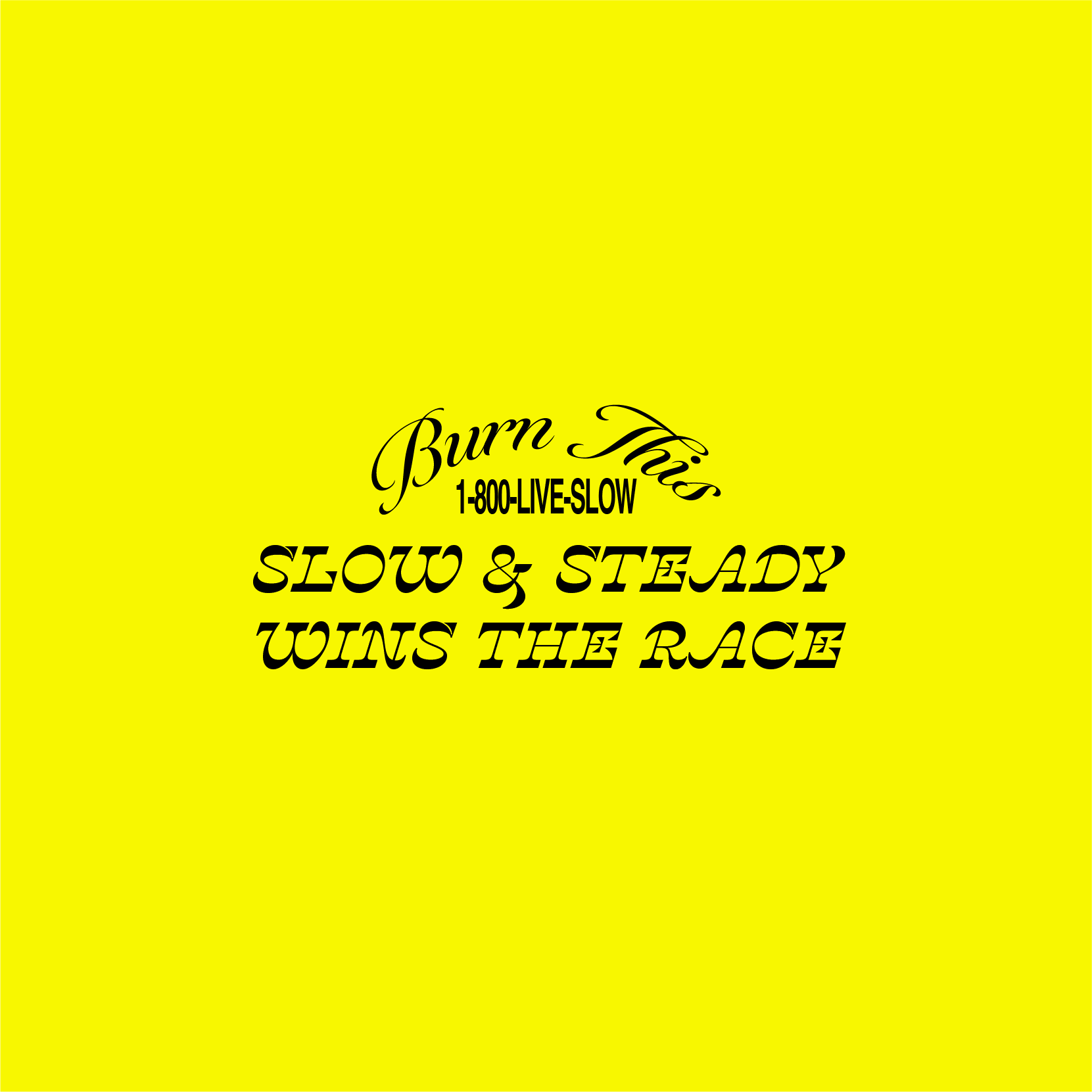
The strategy was built around contrast. A product designed to slow you down, delivered with the visual energy of being shouted at. That tension forms the foundation of the brand: calming by function, abrasive by personality.
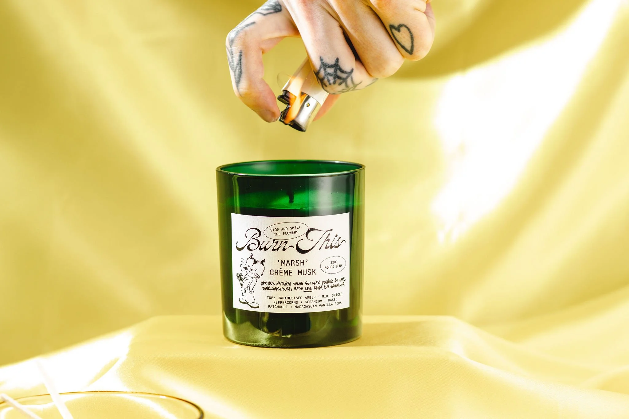
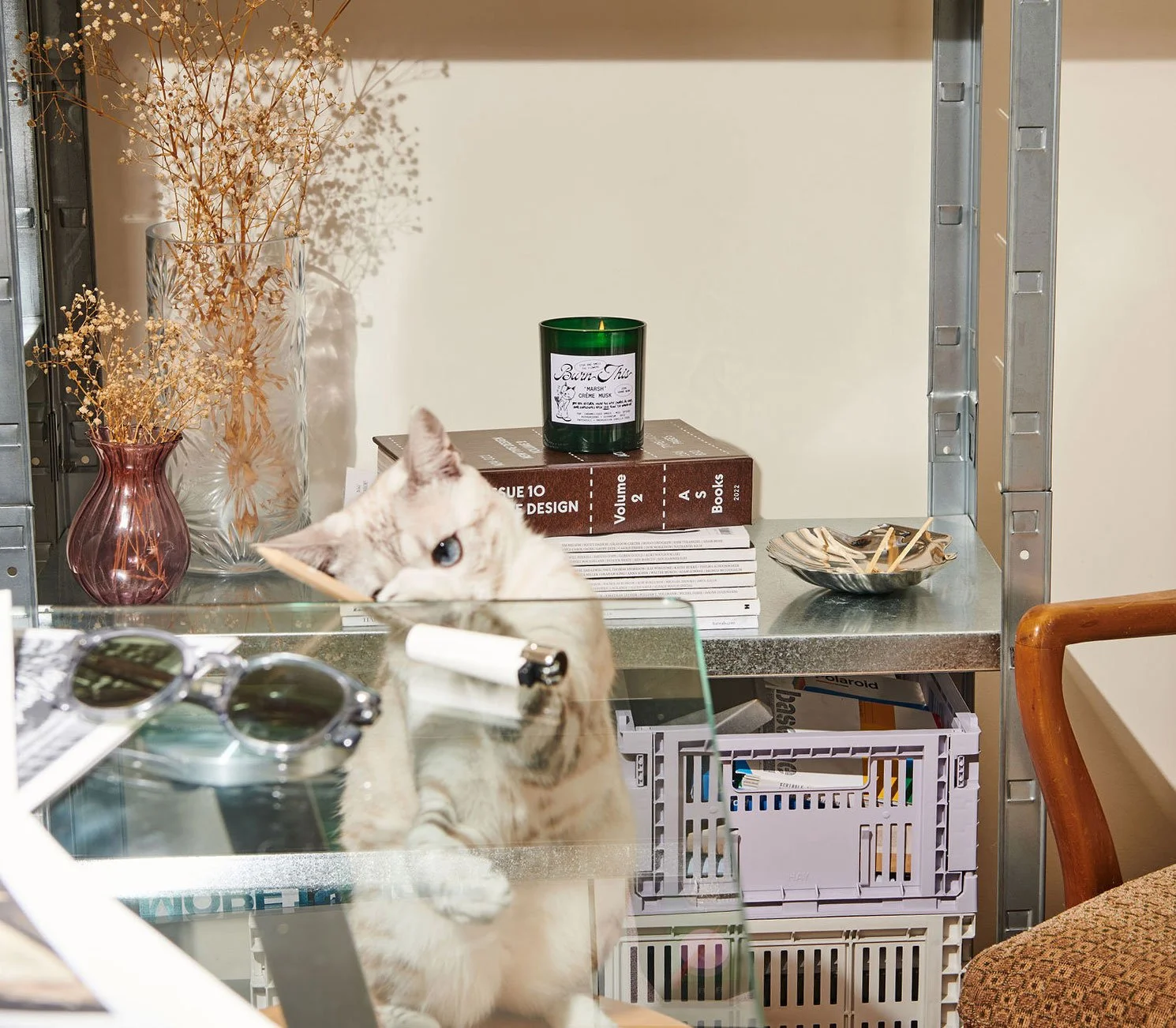
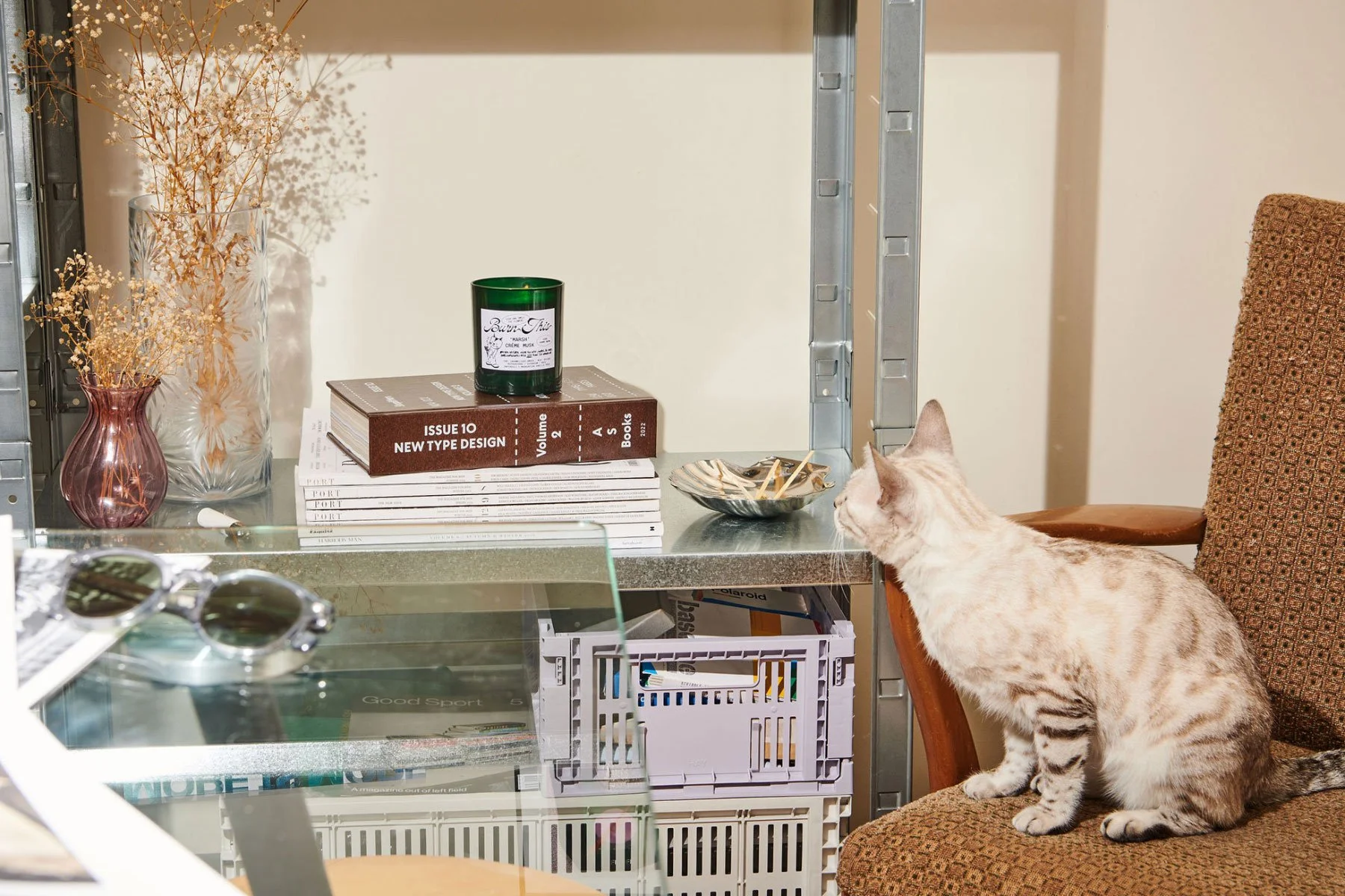
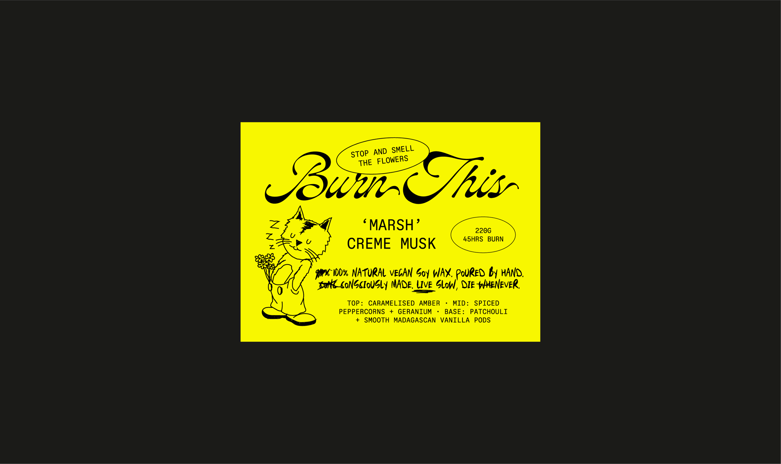
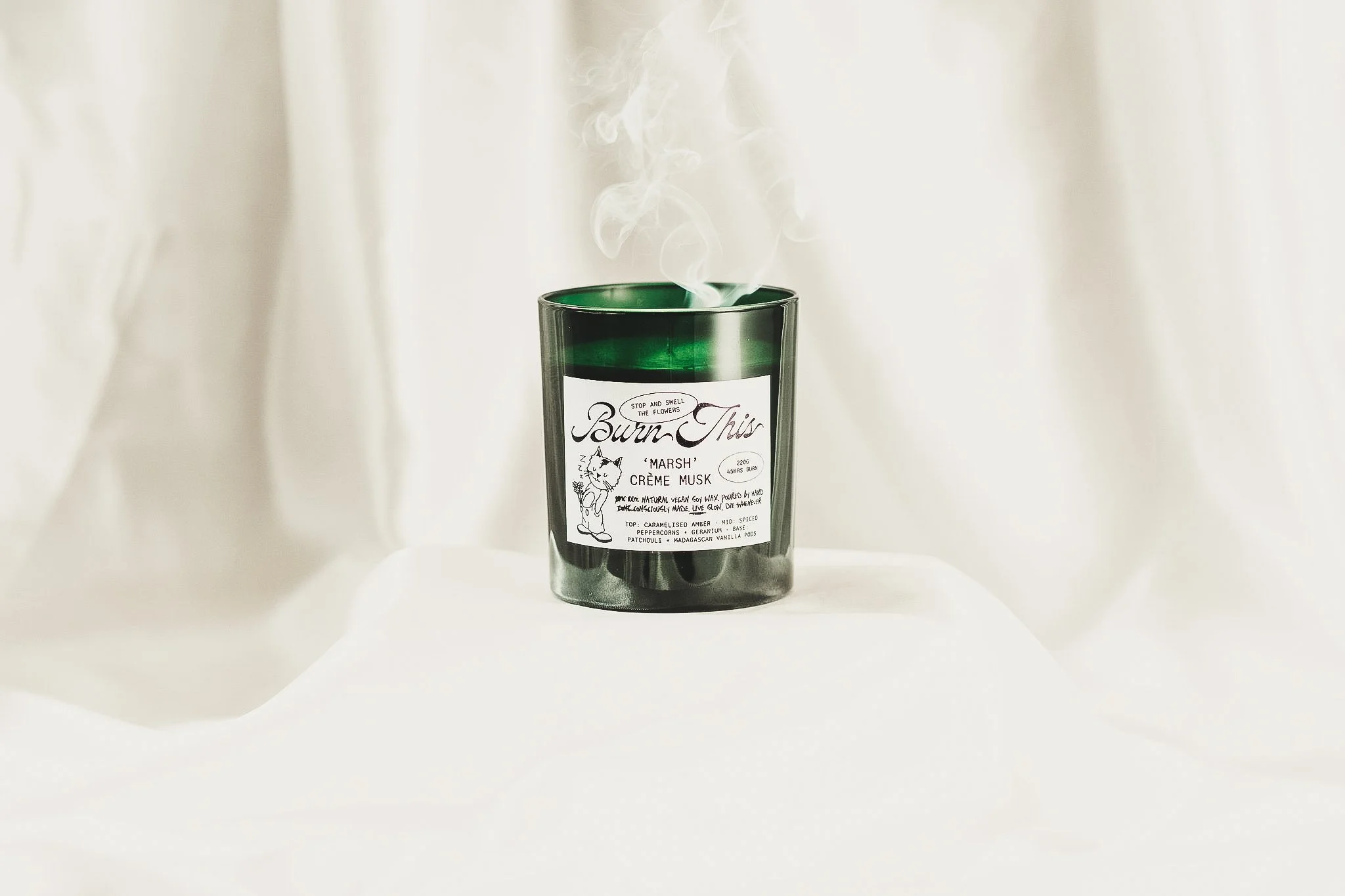
‘Burt’ gave the system a face. The illustrated cat mascot became a character-led device for tone, attitude and recognition, pushing the identity beyond product aesthetics into something with personality, friction and cult-brand potential.
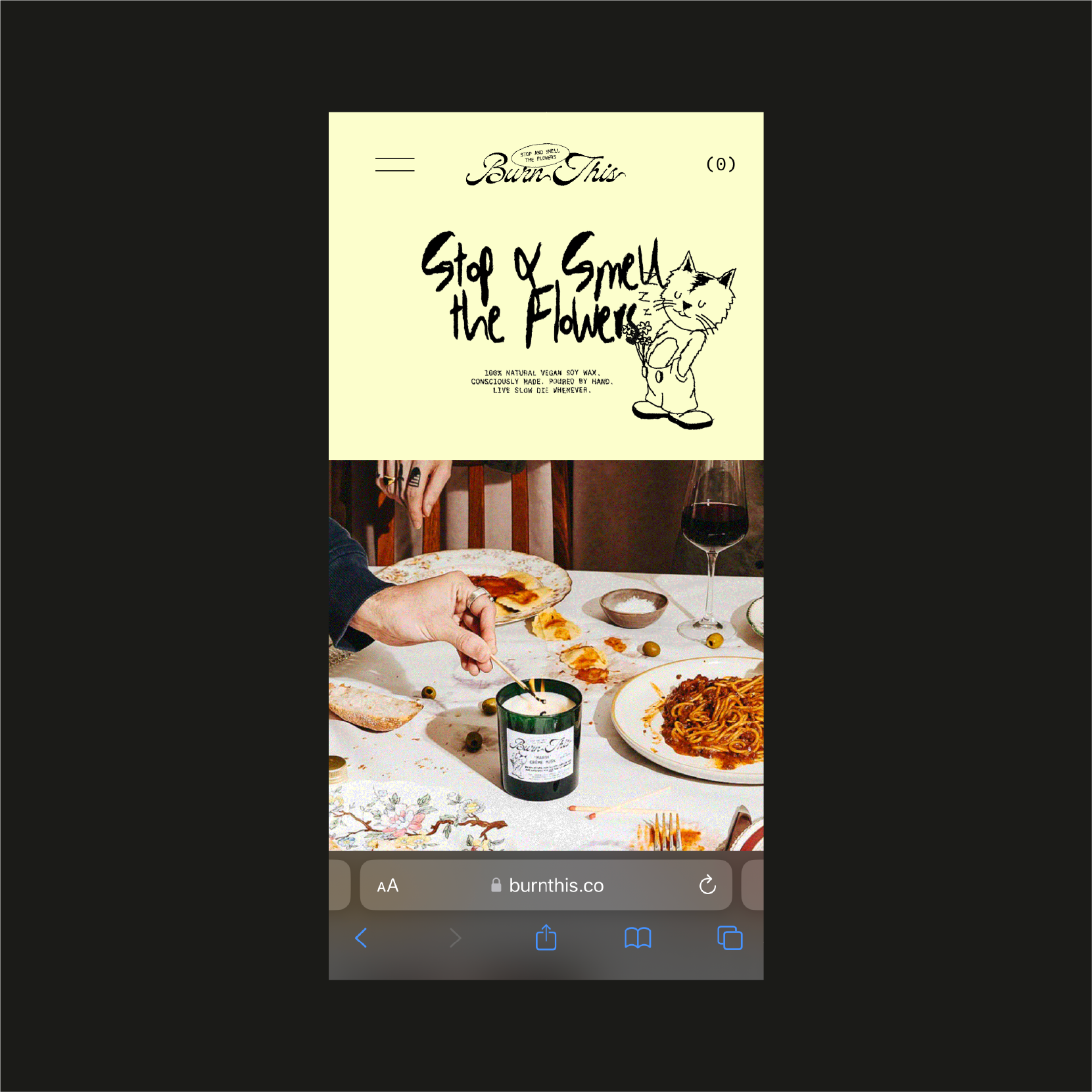
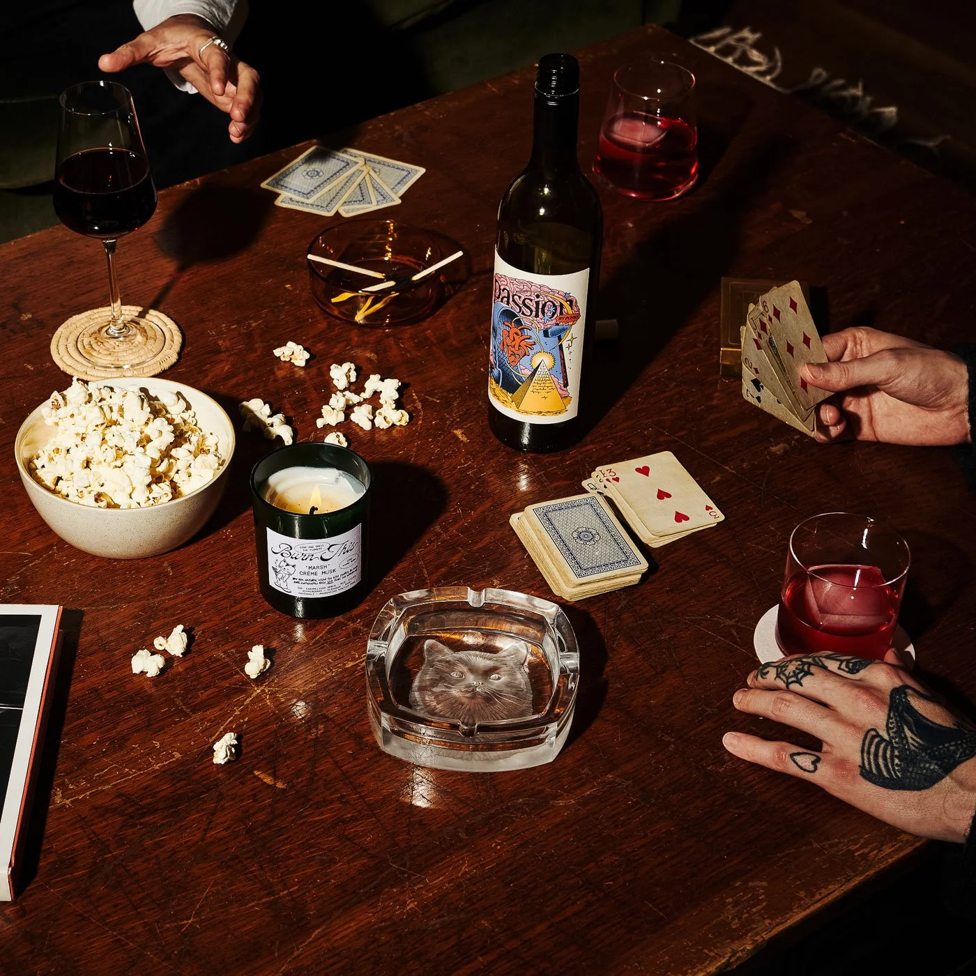
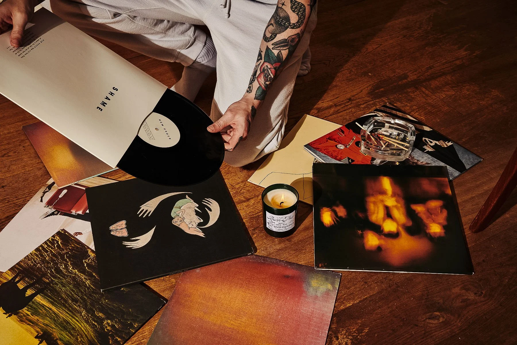
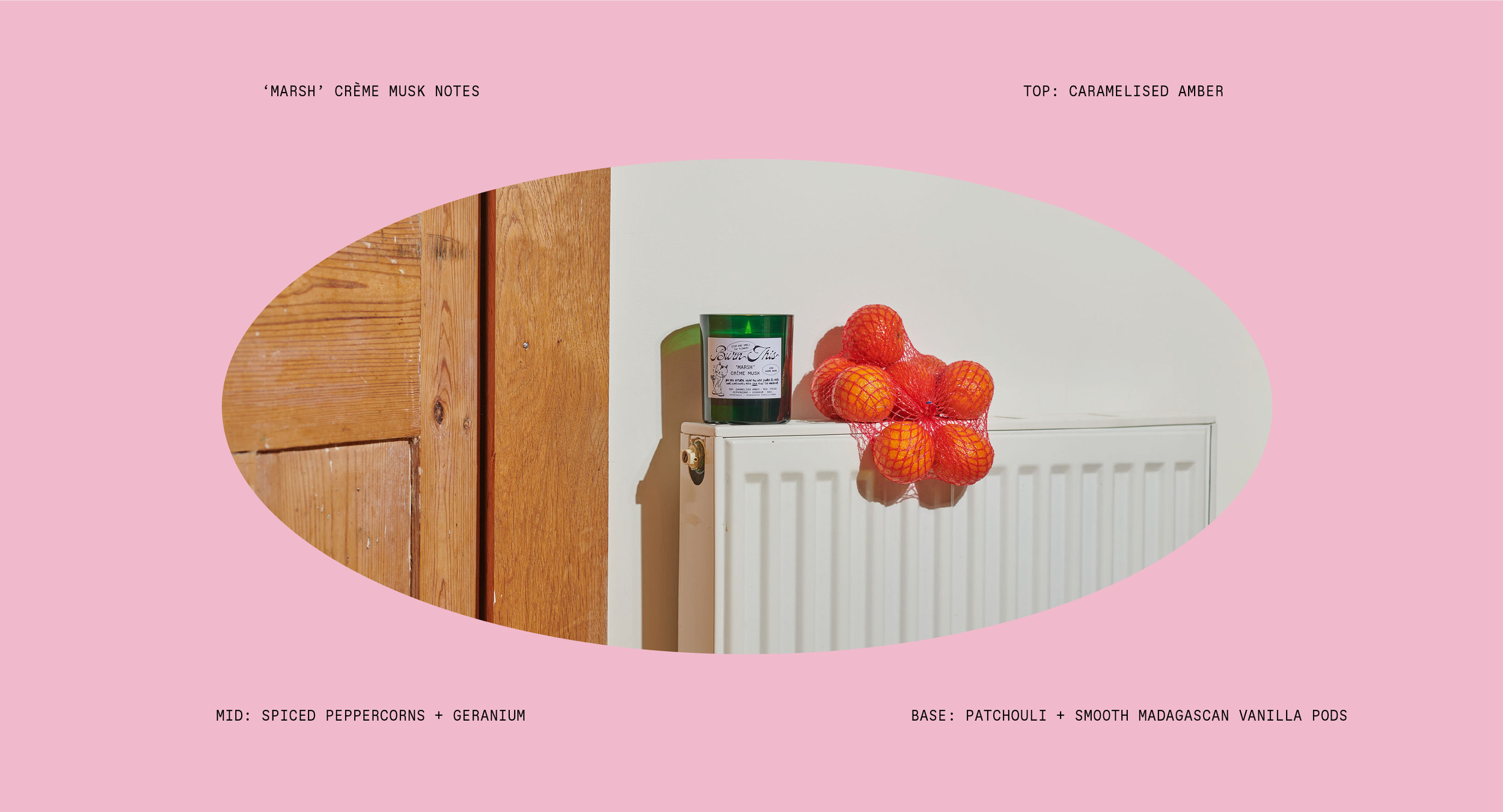
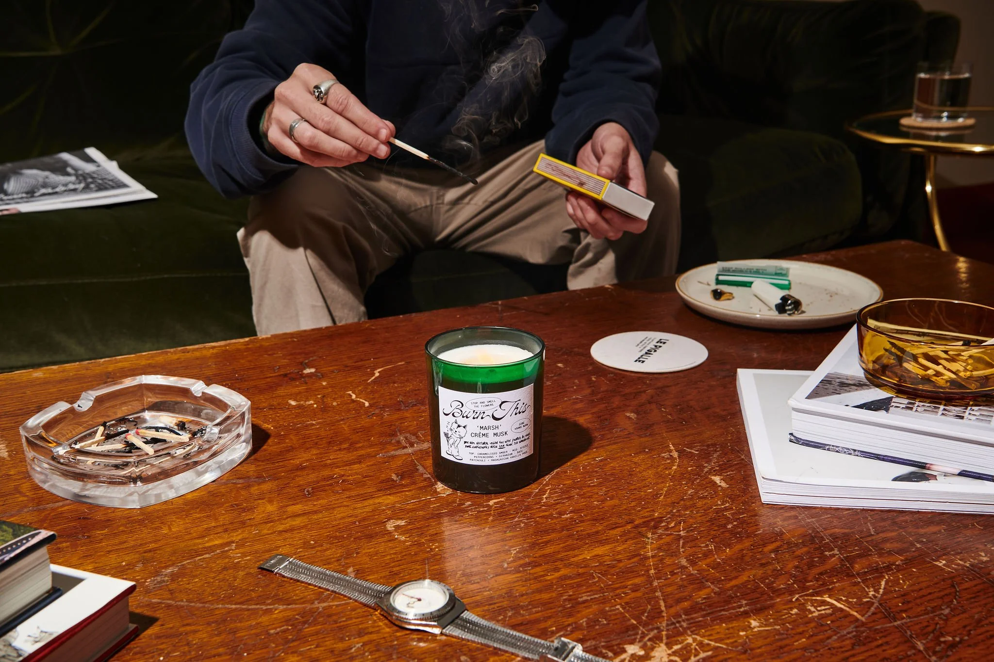
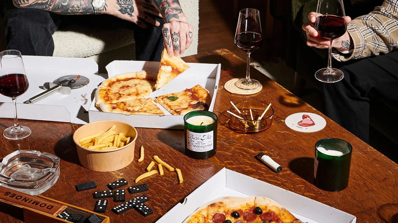
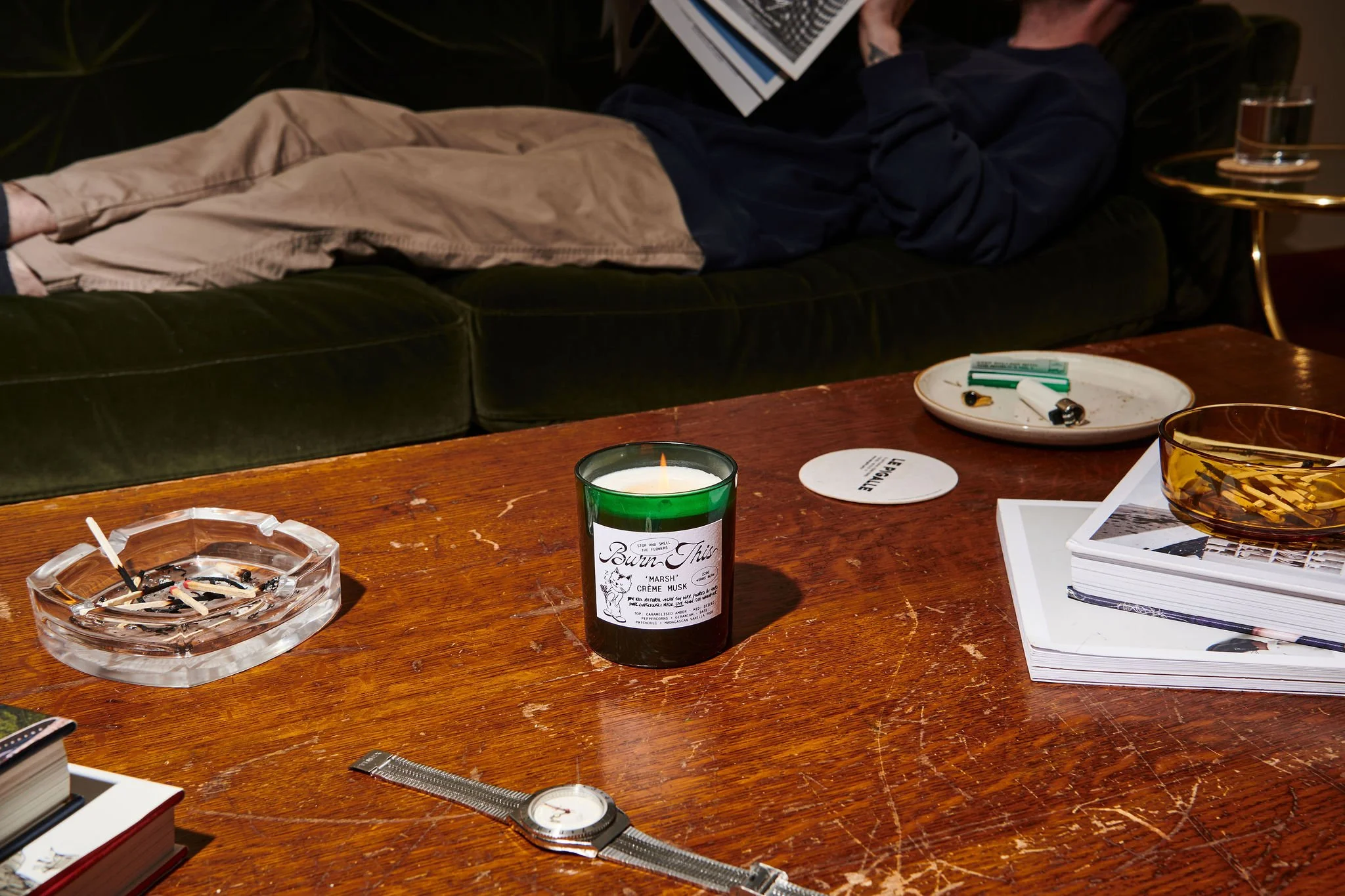
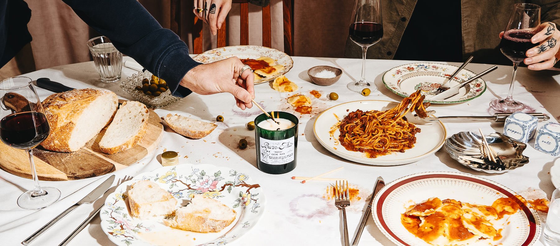
Art direction reimagined everyday rituals through mess, texture, attitude and visual noise. Dinner parties, music, work and doing nothing became a brand language with tension and edge.